

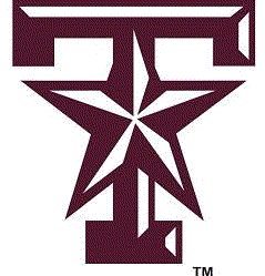
The discussion at Uni Watch today was the poorly executed beveling of the Texas A&M and new UH logos. The beveling of logos SHOULD be a moot point - it's dated AT BEST! But news regarding the Aggie star T logo supporting the story was even more disturbing.
I love the star T logo and was greatly saddened to find out they are trying to limit it. It screams old school Texas A&M (even though it is a newer logo). And somehow, it screams the Corps. I constantly search for products with that logo on it! It shows A&M's uniqueness. But seemingly, the echoed sentiment here is that A&M no longer wants to be unique. They have lost so many of their traditions to fit into the big bad SEC - they have sold their soul to the company store. The only recognition they seem to want now is "Look SEC, we are your TEXAS connection!". Yea, like I said - they sold their soul to the company store. As an alum I am increasingly disgusted by the direction the Aggie administration continues to go in. I have all, but disowned them...
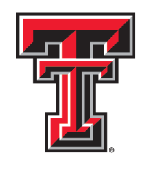
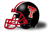
Back to the bevel - Dear Texas Tech, I HATE HATE HATE the beveled double T! Hated it from the day it landed at Texas Tech - never looked new, just clunky. There are so many better looking logos out there. Really! And if you want to do ONE THING to make our football helmets look good again - dump the bevel! Of course repairing it completely would be to add the stripes back and give it a red face mask!
Fitting UH is just now updating their logo with an outdated style, Cougar High...sigh.

No comments:
Post a Comment